Instead of showing you some the of photos that are going into the book, I thought I’d show you one that isn’t.
This is a photo of Indonesian Beef Satay with Peanut Sauce. I do looooove the photo, however, I’ll have to re-shoot.
Let’s play! Can you guess why?
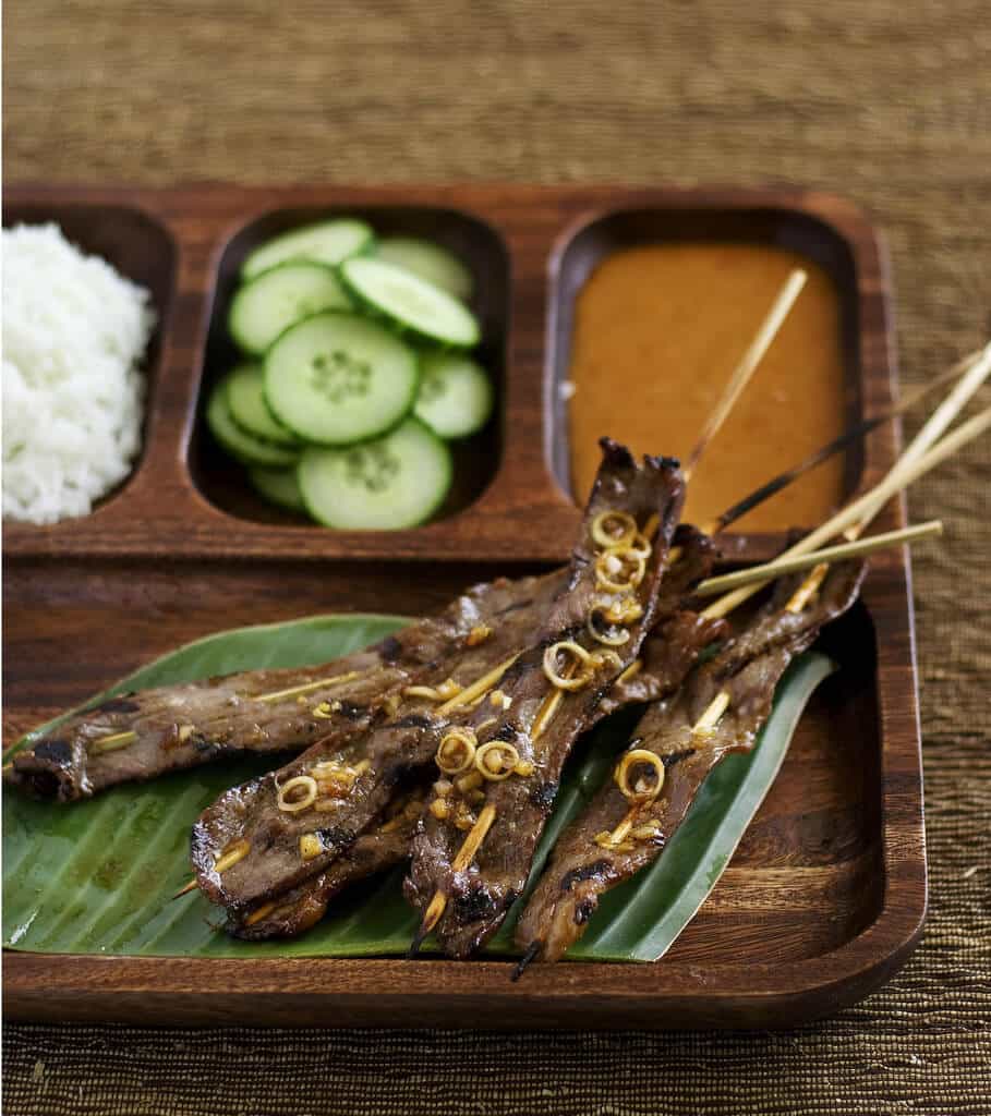
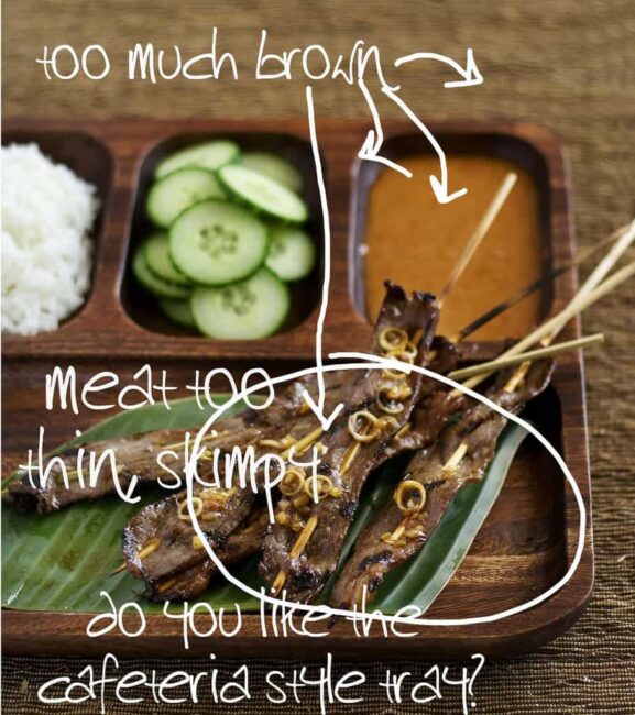
I purchased my my meat pre-sliced at the market – it was thin-sliced sirloin, and all I had to do was cut the slices into strips, marinate and skewer. However, the meat was sliced about 1/8″, which tasted just fine, but for the photo, it just looked too skimpy…kind of like beef jerky. The meat also gets lost in the photo – brown on brown on brown on brown. The satay looked lifeless in the end.
What do you think of the tray? I bought it at Crate and Barrel. I think its cute, but is it too cheesy?
As I’m shooting photos for the book, I’m learning so much about food styling and lighting and using my camera’s multitude of settings. But there’s one thing that my friend, RasaMalaysia reminded me, and it’s that I’ve gotten away from showcasing the beauty of the food. I’m concentrating so much on composition, the props, plates, mats and other styling stuff that it’s become a little too Food and Wine Magazine-ish? Too fake?
I think I need to go back and look at some of my early photography on the blog, where food was king. Some of my favorites are the clean, simple and pure photos, like these:

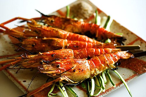
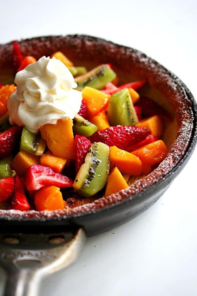
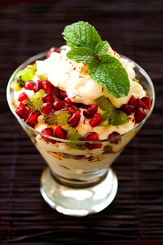
While those aren’t necessarily cookbook-worthy shots, these were all taken last year when all I focused on was the food. Do you kinda understand what I’m getting at? I love the lightness and textures of all these photos. So, my next batch of shots for the book will take what I’ve taught myself technically about photography and food styling and go “back to the basics.”
Would love to hear your thoughts.
***
More food photography posts:
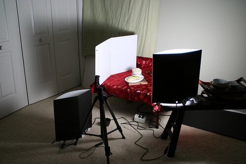 My food photography lighting setup: Lowel EGO
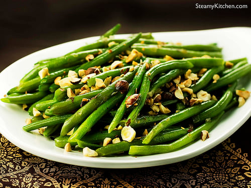 Green Beans with Garam Masala Butter and Toasted Hazelnuts (light setup)
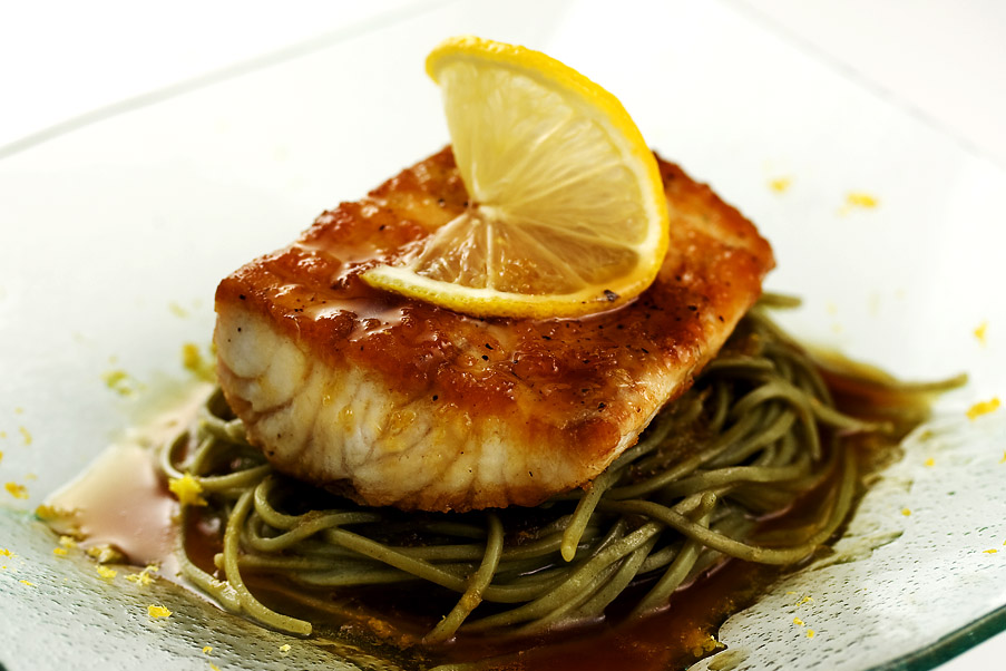 Kona Kampachi on Citrus Soy Soba (see my step by step photo analysis)
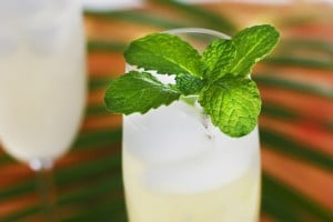 Sparkling Ginger Lime & Mint Cooler (see my step by step photo analysis)
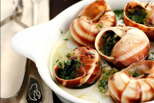 Escargot with Garlic Butter and Splash of Cognac (see my step by step photo analysis)


While viewing a food site I StumbledUpon the other night, I was commenting to my guy about how yucky the site owner’s photos were.
“Look at this! This isn’t food porn! He needs to visit Jaden’s site & learn how to take better photos!”
It’s amazing how often you come up in my food-related conversations…
Hmmm, my thoughts? Really? Are you SURE ???
While your observations of the original shot are perfect (I caught none), I now have a different take.
Ya know how you follow a starlet of some ilk? Movies, Sound, Stage? And they’re spot on? You’re one with them, you want to be with them, hang out and see what happens? Then, one day, years down the road they’re buying giraffes, speaking faux dialects and dating junkies?
Listen to you. The cookbook is about you. The reason we’re here is because of you. If you begin to attempt to please others? You’re doomed. At least you’re cute, you’ll recover.
xo, Biggles
hey girl.. what are those scallops made with?
and, i happen to like the tray, though yeah, the beef needs
to take up much more space? what about a tighter shot?
did you end up eating anyway!? better have!
cheers!
b-
The first thing I noticed was not the brown-ness, but the out-of-focus rice, cukes, sauce and back of the tray. That can work well for some images, but for some reason it’s not working here. If that is your intent, that’s fine…but to me it looks like you need a larger depth of field….longer exposure time and a higher f-stop….say f-16?
By the way, the last image of the scallops works well for me because the foreground and background are both unfocused, thus emphasizing the center.
You do have some very nice images…
I prefer both and believe that both play an equally important role. The close ups and pure food shots are vital to highlight the food’s textures, flavors and overall drool factor. All the other styling stuff can tell a story about the culture and history of the food, through the use of the local and ethnic silverware.
My most favorite magazine is Saveur and their photography incorporates both, simple close ups and great table set up to show the story about the food, it’s people and culture. My motto is to show the food and tell a story about where it came from and it’s environment- real food from real people. So, I prefer to show all different styles of food shots, both close up and from a distance.
You’re right, there is a-lot of brown in your photo, but it’s still darn good!
Actually, I thought the pictures looked good! I enjoyed your post on what your “photo studio” looked like. I don’t have any sort of a photo studio. I just put the food on the table and take a picture of it. Sometimes even on the floor.
I found your blog looking up “flatbread” recipes- so glad I did! I really like it.
i 2nd nathan’s request. I’d like to know about how Yan drops he accent off air, too! 🙂
I also would like to know why “Yan can Cook so can you” doesn’t apply to me. 🙂
The rice is the brightest element in the picture, drawing the eyes away from the satay and peanut sauce since. I would replace the placemat and tray with something brighter so that the eye would instead be drawn towards the darkest parts of the picture (the satay and peanut sauce). I don’t think the banana leaf is working since there isn’t enough contrast to frame the satay and make it pop.
The earlier photos definitely have more heart- am sure you know what i mean- you’re the expert- it looks like you have everything in control…you even criticize your own work- great job steamy!
I love your photos, but now that you’ve pointed it out, I agree with what you’re saying. For the blog though, I say do whatever is more fun for you (since the composition of the entire plate does make for a fun looking dish, I think). I have never put much time into the props, special plates, etc, but sometimes, I wish I did because it really would just bring things together a little more. I guess there’s a balance to be struck. I’m just happy to see well thought out stylings from other food bloggers with better sensibilities than I have as there’s definitely a lot to learn.
I agree. I love those earlier photos. Especially the scallops that just pop out and say, “Eat me!”
Hi Jaden, first of all…you are so “real” for even asking what I think…I mean you are Jaden Hair while I’m just another one of those food blog readers that only dreams of cooking and eating all that good food you all always come up with. I love the tray, if you angled the tray so the edge where the satays are, are closest to the camera, then change the cloth under the tray to something lighter (I don’t know, maybe light blue…sorry I’m a crazy blue and brown person), and either take out the cucumber and use colored bell peppers instead.
As for Martin Yan, when I was old enough and smart enough to know what really good tv watching was I discovered Martin Yan. You get comedy, romance (the food of course) and handsome Chinese man all in one sitting! Now that’s entertainment!
Besides the brown, my issue with the first photo is the angle. It makes everything look flat. I like the wood texture of the tray, but not the compartments, which hides the food.
I would prefer that you had a simple plate on top of a natural wood surface and shooting down lower at table level. Then you can style the skewers, rice and cucumbers to give it more depth and height. Style the food not the props.
But what the hell do I know?!? Just keep it real and you’ll be great!
Was gonna say it was gobbled up by your kids before you got to it! hahaha…Beautiful pics lah nevertheless.
Oh how I LOVED Yan Can Cook. For real. LOVE him.
Man, I think it all looks great. But there you go.
According to the Bread Winner, who is a whizz at photography. Your satay pics need more contrast and emphasised focus. Change the colour of the mat, angle the tray slightly and he thinks it would be much better. He also thought all the brown would translate badly to print. He likes your previous style of pics because they have tension and look more appetising.
Me? I’m the world’s worst food stylist to my eternal regret and wish I could do half as well as your top pic.
I do like the tray although it’s not great for that pic. I agree you are best to focus more on the food. Your food is beautiful and sells itself.
Martin Yan is God.
That is all.
I’ll just bet he is warm and funny in person.
Show the food, warts and all. Your audience is not composed of photography critics, but rather foodies. Real food looks better than art studies of food. Keep slogging; you’ll be famous one day, and then you’ll try to hide that photo of you as a teenage rebel with a cigarette. Or maybe you won’t. Cheers.
There’s so much info packed into this post! where to start?
1. totally agree w/ you about the whole ‘fake food photography’ thing. i can’t put my finger on it, but when things are too styled it just takes away from the actual FOOD. i love the old-school pictures you used to take! they are beautiful and are more about focusing on the food, not props or bright plates or things in the background.
2. MARTIN YAN!!!!! i really like him. to me, he represents the real deal, old-school tv cooks. no bam! no EVOO (GAG), no hoopie-dee-doo. Just yan. sigh!
Yeah, too much brown. Need alot of bright colored foods to pull off the brown tray. Martin Yan wow!! He was my first cooking show. I was amazed how he could use that cleaver, talk about what he was doing and not have a few fingers end up in the food!!!
Can you just tell Yan, that he helped a certain Russian girl learn English and smash garlic? 🙂 He was/is the best!! I loved his show when we first came to America – I would watch is all the time!
I spotted the meat being too thin but not the overly-brown bit. But then I tend to focus on the food more than the overrall picture, being an amatuer 🙂 I agree with Rasa Malaysia though, and I have noticed that in my own photos. In the past when I was just using a point and shoot, I tended to frame my food shots very tightly. Now that I’ve been playing around more with my DSLR settings, I think more about the overall composition and props and so on. It’s always good to go back to basics ever so often to keep focused.
Love the tray, it reminds me of a shallow bento tray, but then I’ve got bento on my brains, heh.
Cool deal on meeting Martin Yan btw! Make sure you tell us all about it!
Wow Jaden! I haven’t had the chance to check back on your blog as often as I’d like, but I’m always wowed whenever I do. I’m so proud of everything you’re accomplishing in so little time!! I know it must’ve been years of doing what you love, but it just goes to show all the good things that happen when you follow your heart and do what makes you happy. Congrats on this huge learning experience!
I love the tray too…Don’t think it’s too brown but agree that the beef looks a little skimpy.
BTW I only just stumbled onto your blog & wondering why I hadn’t found it sooner. Great pictures.
I love the food-centered photos more, but I understand the need for incorporating some nice silverware, cutlery, backgrounds, etc. It’s like looking at interior design magazines…you know nobody ever lives in living rooms or bedrooms that uncluttered, but it’s nice to fantasize. Cookbooks are just trying to show off a certain type of lifestyle.
And I love the tray. I should get myself some at Crate & Barrel. 😉
I didn’t think the beef was too thin; I thought it was that way on purpose…easier to eat. Enjoy your visit with Mr. Yan.
I think all of your photos are beautiful, then and now. I do prefer the earlier ones. This may sound weird, but they seem more…exuberant. It’s like your enthusiasm for the food flows through them. And no, I have not been drinking. 😉 If I saw any one of those shots in a cookbook, I would be inspired to try the recipe.
P.S. I love the tray!
yeah, meat does look a tad thin, but i love the tray – i think i’ll get one. only, i wish there was a bigger compartment for rice and a smaller for meat. i think of it more as bento style than cafeteria.
I think props detract from serious food porn. I prefer your original style which is clean and simple. I guess because I do a lot of landscape photography – where you shoot with what you’ve got, no setting up the scene with random crap – I have a similar take on food photography. Most importantly, you should have fun with it. So have fun with it, woman!! 🙂 You’re doing great.
Please ask Martin what his secret is to staying so young looking. He is still a Hunka-Hunka Chop Suey!
Photography, for me, always seems to be a work in progress. I learn from others, from myself, from my mistakes and the few successes… *grin
I think with a little experimentation you’ll be able find the perfect marriage of fab food and props. I love what you’ve done with the props you’ve used recently – it really showcases the food well, but I’ve been missing the “droolworthiness” in some shots. It can be so hard to find the right balance of texture, color, and eye catching interest… but you’re doing wonderfully so far!
You can see a definitely difference in your work last year vs this year – but hey – you know that already! I’m looking forward to what you come up with – but I definitely appreciate the splashes of color. I know in many Asian cultures, showcasing the food/presentation of a meal is just as important as the food itself… so I wouldn’t necessarily ditch the props, but maybe use them in a slightly less pronounced way?
I dunno… I’m just glad that you’re heeeere. Without you, I never would’ve discovered the wonders of No Knead Bread, how to make teh awesomest steaks evar, or Japanese style fries!
I didn’t see anything wrong with your beef satay shot, either. But now that you mention it, the earlier, close-up, brightly-colored shots are fabulous, and much more appealing.
Isn’t it interesting when we photograph for what we think others want to see we tend to get away from our own style or what catches our own eye.
I like both your close up & clean shots as well as the set ups you are doing lately. I am inspired by the set up shots I see everywhere, but recreating them myself produces photos that I don’t usually love.
I like the tray but it does need some red or bright yellow. Maybe the sauce inside something in the tray? Like a bell pepper? Maybe green cloth underneath. Or more leaves. The beef could be thicker but I don’t think it looks terrible.
That is my two cents. 🙂
mmmm….normally we use thicker cubes of meat for satay…
the use of thin pre-sliced meat is intriquing, i’ll give it a try and if not good u got some spankin coming, young lady hehe
ask martin yan how he incorporates kung fu and taichi in cooking video presentations and maybe later u can incorporate boxing/hip hop/yoga in yours 😉
keep the photos delicious! have fun meeting martin yan!
I agree with you. Too much Brown.
I really love your former photos: the German pancake is one of my favorites. What they all have in common is this “food porn” that you talked about in your earlier posts, and, I dare say, a sharpness that I don’t get from your recent photos. Must be the light. Must be the size of the photo as well. Or the two much brown 😉
I think you should try and see what you like the best. Add more colors. More white background, may be. You have the eye for beautiful pictures and I’m sure the final result will be great. 🙂 Wishing alllllllllllll the best, Jaden.
Jaden, are you kidding? All the photos you have taken are definitely cookbook worthy. Honestly, I like the ones that focus on the food itself. They make me want to run into the kitchen and recreate them.
I love your tray… and the photo is good. Maybe, a little red prop might help on your issue about too much brown? .. Like a red garnish — red bell pepper perhaps?? Just a thought.. what do I know.. your pics are wonderful.
First – I LOVE the bokeh in this shot. EXCELLENT job.
You have a great natural eye Jaden. Trust it.
Apply Charlie Parker’s philosophy on music theory to your photography – “Learn everything, then forget it all.”
have fun with the yan man!! when my hubs was at the CIA, mr. yan came for a demonstration. all the students were like, whatever. but each of them walked out of the lecture completely in awe of his skills, his friendliness, and professionalism. you’ll have a great interview!
as for the photos … i’d say stick with what feels best for you. in some ways, i think to myself, all my food photos feel the same: close-up. how boring. i look at other blog photos that are “place-set” with a spoon and a flower vase, etc etc and i’m like, i wish i could take photos like that.
and i then i think to myself, why would i? sure, those other blog photos look good. but close-ups are my thing i guess, my own style. instead of working against it, and wishing i photographed differently, i’ve decided to increase it, make it my strength, make it perfect. you know what i mean? go with what feels good for you, and then make it great. everything else will fall in place from there.
but if you want to know my real opinion, i love the “just food” photos best 🙂
Huh. I would have said that the depth of field was too small, with too much out of focus. I bet that if you played with your f-number the ‘too much brown’ would cease to be an issue. And for all you brown haters out there, check out Ralph Lauren’s Fall 2006 men’s line to see how you can make brown “pop”: http://men.style.com/fashion/collections/F2006MEN/review/RLMEN
+I think it’s a huge fifference with pictures for blog an dpictures for a cook book. I looked into some of the cookbooks I own after reading your post and I have to say lot of the pictures do have the table settings, flowers and non-food things in the picture.
And Martin Yan, give him a hug from me ;). I still watch his re-runs on PBS 🙂
I happen to LUVVVVV the cafeteria style tray- i think sectioned plates and trys are the best! But I agree, my favorite photos of yours are the ones where the food is really what I see.
I think you should ask Martin what he thinks of your food photos.
Brown on brown just doesn’t pop.
Ask Martin why he thinks color contrast is so important.
Oh I forgot to add…did u know martin yan’s mother is a doctor?
Jaden, I really like the photo u shot…very natural and i love the back being a touch out of focus….i took a photography class eons ago with the manual cameras and i remember the teacher giving us specific homework in creating the focus and background just as u have done here….
if only i could remember what aperture is…..
i saw him (martin) give a cooking demo a long time ago when i still lived in salinas, california. i think it must have been about 25 years ago, at least! wow. anyway, it was pretty cool, his show was not out very long at the time, and so i got a place right in front. he was very nice, but i was too shy to say much at the time.
suuure… there’s a lot of brown. and suuuure… the beef looks skimpy (and perfect and delicious). but the lunch tray? compartments? who doesn’t like that? i mean… hello…. bento box! compartments and trays and boxes are in. i’d pay good money for that plate of food (and the plate itself)!
While I liked the satay shot when I first looked at it, I can see the “too much brown” part and thicker strips of beef will probably look more appetizing.
That said, I happen to think the shots you say are not cookbook worthy are fantastic! I’d be intrigued enough by those photos to consider buying a cookbook with any of those shots on the cover! Just because they are clean and simple, doesn’t mean they aren’t awesome! I just want to reach into my monitor and grab a bite!!
Have fun with Martin Yan! I remember watching him a while back with my grandmother – we loved to see what different pun would be on his apron each show!
I think your photography is amazing. I love the ‘last year’ shots. They are very clean and ‘food focused’. They are gorgeous. I would suggest to lean more towards that style, but also incorporate a little of what you have learned. The combination of your photos/recipes are what bring me back to your blog. Don’t change too much!
Have fun w/ Yan!!!
In french we use to say something like “too much brown kills the brown”, and you can say that for all the things you don’t like :))))))
Example : too much work kills the work 😉
But I think It looks very appetizing !
Yep, go back to basics and let the food reign supreme! Your photos are always so impressive to begin with, but I imagine that as you gain experience it’s easy to forget the simple things that worked well before you knew so much.
The tray is cool, but perhaps it would be better suited to a different dish. You need more contrast with the beef satay. I’d still eat it anyway since I think it looks really delicious in spite of the browns in the picture! LOL!
I prefer the “food is king” shots much more.
Those make me hungry!
The tray looks like Hawaiian monkeypod…if so it can’t be cheesy! The food left me salivating..No one eats the tray so who cares!
Jaden, I love practically all the things you photograph and and the food you cook looks delicious. Yeah, I am like the creepy ‘Misery lady…, your biggest fan! It is very difficult for me to criticize you!
I agree with the comment about your flavoured salts picture. It was so simple and artistic it was eye catching.
Have you been asked to do a non-professional food photographer chapter in your book? You could do a blooper reel but at the back of your book. I really like that idea.
P.S. I like your poshed up TV dinner tray. Really.
Hi Jaden-
I like your earlier pictures that focus on the food (as well as the shrimp and noodles just below the post).
They all have one thing in common (to my eye anyway).
One look at them, and you want to reach out and take a bite.
It just doesn’t get any better than that.
Martin Yan’s new series on PBS is his best, taking you on a tour of the various regions in China and dining locally on regional specialties.
I’d certainly ask him about Chengdu and the region that’s hard hit by the quake. Does he plan on going back there in the near future?
Of course, I can see you asking Martin “Why not a charming, easy on the eyes, Asian co-host for next season?
Trust me, it’ll work.
Can’t you just see it now… “If Yan can cook, Jaden can cook too”.
I loved Yan Can Cook and I have a book by him. My first forays into Asian cooking was because he made it seem all so simple.
As for your photos, I loveyour work, but I agree we can get to wrapped up in the staging and forget about the food. I would have focus in more on the Satyas and less on all the acrouterment. I know your book will be a visual stunner and who can claim to dvelopw the recipes as well as photograph!My pesonla opinion was that on some of these top food blogs I see Im drawn in visually , but when reading the recipe Im not really feeling it. The hook was the photo but I wouldnt really want to eat it.. With you you have the great food and the photos!
The cleaner shots you like (and they are gorgeous) are bursting with color. The hardest thing to photograph is meat- so much brown. Fruit, fresh green herbs, colorful veggies are way more fun. Maybe it’s not the props per se, but the similar neutral colors that you don’t like. Put that (yummy looking!) steak on a bright hued tray with a contrasting color mat, etc…and voila!
I thought it was because there is a little face on the topmost middle piece of beef, the grouping on the bottom of it. At least it looks like one to me – kinda like an owl. Which just proves I spent way too much time trying to guess what was ‘wrong’ with the photo.
I think with the photos that, ultimately, what you want is right on that line between “this looks so good to eat that I have to make it” and “that looks so complicated / restaurant-y that I probably would never have time to make it, so oh well.” Don’t worry too much. You’ll find that balance.
ooo, martin yan! i’d be interested to hear about what his accent sounds like while off the show.
I wouldn’t have noticed anything wrong with it unless you pointed it out. The brown tray on brown is too much now that you pointed it out.
I do really like the clean and simple style photos.
How cool that you’re going to meet Martin Yan!! I’ve watched his shows with my mom ever since I was little. I love his personality and enthusiasm when he cooks. I’m always amazed at how he can cut and chop soo quick and not cut his fingers! If Yan can cook, soo can you! 🙂
I love all your stuff…
Your plates, garnish, background etc
should be calculated to be seen but not noticed;
If something is so detailed that I notice, say,
the design of the plate first, or that the tray stands out
in contrast to the food- well…
The post “Making your own flavored salts”…
Beautiful, but sparse.
Stellar composition…the substance is the star.
Just an opinion from JAFO.
xo
TBG
I love the basics for food photography. While having a good background, proper lighting, and placement is key, I always think that if the dish itself doesn’t provide enough color and PIZAZZ (watch Funny Face…you’ll understand) then it’s not worth photographing.
Like, if i don’t have the tablecloth, roses, dress, runner, goblets, forks, knives, other dusk collectors… then the food won’t taste as good. That’s what staging is to me… dressing up a crappy meal.
Give Martin Yan a cleaver and some garlic, and tell him to crush or mince it for you.
He does it in one freakishly fast slap of the cleaver to the cutting board, and the garlic comes out perfect. It’s mind-bending. One second, there’s a clove of garlic, and then, “thwap!” it’s a nice pile of minced garlic.
I really could watch him cook all day.
As for the photograph, well… I think the satay picture should have been shot from a little lower and a smidge more to the right. And, perhaps a more open aperture to blur the background a little more would have helped.
I think I’m too much in love with your photography to notice there’s anything wrong on those photos 🙂
I like the tray, but the meat does look a little thin. I also would have put the cucumbers behind the meat and the sauce in the cucumber slot.
Focus on the food. Yep, good plan. But I’d enjoy that satay anyway.
Have fun tomorrow night!