Today I spent a half hour at one of my kids’ favorite Italian restaurants called Gio’s. It’s run by four of the hottest brothers in town. Like SERIOUSLY HOT. All of them. But that’s not the reason why we went there. I write a monthly column for a small community paper and listed some of my favorite eateries in town. Gio’s was one of them, because my kids’ like their pizza. It has absolutely NOTHING to do with the hotness factor of four brothers.
Anyways, it took about 10 minutes of click-click-click to get the perfect food photography shot.
Wait. It was more like click-repositiontomato-click-drizzleoliveoil-click-morecheese-click – food photography interspersed with food styling. By the way, I scheduled the photoshoot appointment with the Gio brothers when the restaurant was empty. Don’t ever be rude and try to do this in midst of your dinner and every one else’s dinner.
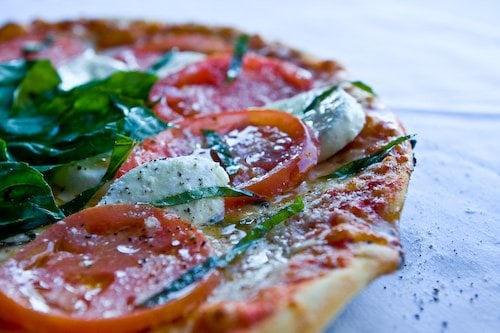
I’ve created a nifty slideshow with commentary on the food styling and photography. See how I got from this:
Continue reading GETTIN’ THAT MONEY SHOT
Food Photo #1
to the money shot in 10 minutes. <– clicky right there for slideshow
If that link to the Food Styling and Food Photography Slideshow didn’t work – let me know? I’m using Lightroom and it’s a new program for me.
Food Styling Notes
Yes, so this was a 10 minute photoshoot. I didn’t have to make the pizza, nor did I have to slice any of the ingredients, but just a few adjustments to ingredients and placement …well the RIGHT ingredients totally transformed this photo. Just quick food styling.
It needed texture, contrast, and sheen. It needed spices (black pepper) and herbs (basil) so that YOU could look at the photo and instantly imagine how it tastes. The texture came from overlapping the tomato and the mozz. More texture came from the basil – both whole leaves and julienned. See how the basil drapes over the ingredients? In a photo that close (macro) the black pepper and grated parm added nubs of texture too. Olive oil added the sheen and moist factor. I took away distracting elements (pizza pan and the pedestal stand)
My food photography lighting? Free. Came from the big window. I just chose a table right next to the window. Can you tell where the window is?
Well, I hope you enjoy the food styling and food photography notes that I take – I know I get lots of emails from readers asking for more information on food styling and photography! What do you think…is this helpful?
Steamy Kitchen New Web Design
Oh, do you like the new design? Long story short – traffic too high for current shared hosting server. Had to move asap. WordPress theme didn’t work on new server. Needed to customize new theme in 24 hours.
Whew.
I still have a lot of work to do – but at least it’s functional. And yeah, I know my thumbnails are not there….it has to do with my photos being hosted at Flickr and not on my hosting server. If I had one advice to give to beginner bloggers – DO NOT LET FLICKR HOST YOUR PHOTOS. I swear, it’s a pain in the ass.
p.s. Flickr, I’m sorry. I love you. Please don’t be mad. You still have all my food and family photos stored there at your house, so don’t be pissed off and do something stupid like throw my photos out the window. I didn’t mean what I wrote.
Shit.
***
Food Styling and Photography Gear
I’ll probably write an entire post about my gear…my ghetto gear and my not-so-ghetto-gear. You interested?
Here’s what I used today:
Canon 40D + 24-70mm f/2.8L lens
Ouch. I know…..pricey! You can get the EXACT same photo with this setup:
Don’t go for gucci pricey stuff unless you’re A) filthy rich B) have a sugar daddy or C) insane like me



With a single presentation, I feel very hungry not only for pizza but also for food photography. Thank you.
I am a professional photographer who would like to get into food photography. I love food and photography is my passion. I stumbled upon your sight looking for a Vietnamese Chicken Pho recipe. I must tell you, I think I’m in love. I need to spend several more days looking over your sight. I love your photography. I love how you use real food when doing your food images. I am going to need to get that lighting system. I have been using my wonderful kitchen window, but once the sun goes down….
Thank you for all your wonderful information.
So…is lightroom worth the price? Love the look of your new slideshow. Easy to use? Anyway, site is great…and the numa numa just a bit a kid fun…thanks! (My “little boy” is amost 16 and I miss the silliness of your boys.)
I love Lightroom. But the slideshow is a plugin for WordPress. ~j
Loved your slideshow!! It’s great to see how the process works in someone elses mind…:) Endresult looks fabulous too!
Simone
Thank you for those tips! I’m just starting with food photography and learn a lot with this kind of articles. I found yours very interesting 🙂
I LOVED the slide show. Thank you so much. it really helped!!
Very informative slideshow! Your photos always look so gorgeous, and you’re so generous to share your hard-won tips. We newbies can’t thank you enough. 😉
Love the food Porn – not sure if I’m more hungry or horny – I like the way you some how blend food and sexy. Where did you learn so much about photography – I love the slide show – I now want to go home and either make pizza or love – not sure which one!?!
I’ve always loved your series on how u arrive at the $ shot, and now I luv the new engine showing the pics. Your food photography is an inspiration to me and I learnt a lot from your sharing =)
Great post Jaden! The new looks great – Arthemia is a great theme.
zesty
Great tutorial! I’m still trying to find a perfect lighting condition that I am comfortable with for my photographs!
Great tips and slideshow. Thanks! So amazing what a little shine can do for a photo.
The design is coming along very nicely. When I was designing my site I thought about hosting my photos with Flickr, but for some reason I opted not too. I guess that was a good idea.
We haven’t reached your height of popularity, yet. But it’s nice to see some of the decisions I’ve made will pay-off down the line.
I am new to your blog and love it! The photography is excellent and so are the wonderful tips. I shoot with a Nikon D80 with Nikon lenses such as 18-55 and 55-200, but I am so tempted to spend the $$$ for the 18-300.
After using a Nikon FG2 for years I switched to a Canon Eos Elan and now to the wonderful digital world. I always carry my little Nikon Kewlpix S10 a very affordable excellent camera. This swivle lense design lists as high as $499, but I bought it at Costco for $229, and now I see it online for $159-a steal for this quality.
My fav photo shot is of Nathan with the pizza!
Shanti
SF Bay Area Foodie
I’m highly interested in the brothers too. Ahem. Great job on the new layout! I’m not sure why the slideshow for me went by really fast and the commentary flashed for like 1 second, anyway to slow it down?
Yeah. I’m with you on that one. The GIO brothers are gorgeous. I’ve been following them around Bradenton for years at their different attempts (Portofino’s). In fact we’re going there tonight for dinner.
I sympathize with your son’s penchant for parmesan! Thanks so much for the tutorial.
Hi Jaden!
I’d like to thank you with all my heart for all the information on food styling and photography you share with us. It’s very inspiring – especially for enthusiastic photography beginners (like myself:). Your photos are so mouthwatering, thanks!!
ooops, sorry I spelled your name wrong jAden 😀
But Jayden… Where are the pics of the brothers???
We need more tips! Keep ’em coming!
Jaden,
I love the photos and your witty commentary. 😀
I would like to make a suggestion, if you don’t mind. I think that the pizza would be even more appealing if you warmed up the photo; it looks slightly cool.
Are you doing a custom white balance (CWB)? I’m just starting to use my Robin Myers grey card for this, but I am loving the results! When I use it, I don’t have to correct color in post-processing at all. 🙂
I love going thru the tutorial. Now I want to eat at this place and want to taste that beautiful pizza. What are the reasons you say not to use Flickr for hosting our photos? That’s what I am using right now.
I do like the new design, except I forgot where I was after I started reading. But, that really says more about ME, doesn’t it?
Thanks a million for the photography tips.
The new design is fine – I’ll have to get used to it before giving you a full opinion though!
I love your food photography tips – you’ve changed me from being a crap photographer into a not-so-crap photographer – and there’s a lot of work involved in that – I have no talent, I’m sure!
My favorite photo? The last one…he is adorable!
Yes, the slideshow was very helpful. Thank you!
I loved the slide show. What great pictures. I’m way too lazy to do all that food styling on my blog but you gave me some inspiration to do better.
Thank you!
The main difference I see between the two is where the focus is. I’d love to hear why you chose the one over the other. They both look great. I think food styling is so much fun. You can get as fancy or simple as you have the time for. Even just some crumbs can make such a difference.
Sorry you had to redo your website. It looks great though. I’m working on a new one right now, fortunately my husbands a computer nerd and I’m not on any time constraint, so it’s not stressful.
Thanks for sharing your work. There’s a huge difference between the 1st shot and the money one. I’m salivating on the money shot!
This is a great tutorial. Thanks so much for posting it! Is there something about Flickr we should know? I host all my blog photos there :-/
If you ever change themes and your theme calls out a photo to auto resize for a thumbnail – you need those pics on your server. Otherwise the theme won’t work. ~jaden
Taking pictures of food is hard! I’ve been trying to take pictures of food to post on a weekly bb for cookbook/recipe reviews. It’s hard! There is so many factors is getting a decent shot. I like that you are teaching us how to take better pictures ourselves. Thank you!!!
I agree. I would like to see pictures of the 4 brothers. *nods*
Love the food styling tips.
I love this restaurant too! And yes, the brothers are hot. Great post!
Great new layout and photo tips…I enjoy reading your posts!
I love the new layout, and thanks so much for the photo tips. I disagree with that one comment… if adding oil or pepper or more cheese makes it more appealing, and it doesnt change the integrity of the dish, then why not?! It looks pretty! WHERE are the pictures of these 4 brothers?
Sorry, but isn’t this exactly what we food bloggers set out to change? I do understand making the best out of the given, but the extra moz, tom and basil is not part of the dish the place is serving (as I understand it – it doesn’t come out of the kitchen like that), you just made it more beautiful for the picture. Anyone who sees the photo and decides to go in there and order the pizza will be disappointed big time. What is the difference to regular food mags and ads anymore?
The pizza is beautiful, but where’s the photo of the four hot Gio brothers?
re Flickr: SO agreed, why would we trust a primary asset to a free service, to a service that could disappear in an instant? (Just look at what Google has done to FeedBurner.) I cringe every time I see a blogger putting their photos onto Flickr.
I like the photo and styling advice and would be interested in reading more from you. I’m currently taking a photography course at UT so my general photography skills are improving quickly but putting it all together in the kitchen is still a challenge at times.
I’d be more interested in your ghetto gear because you get great ideas that way. My light box is literally a box. Cardboard, sides cut out and replaced with tissue paper. I need to start using it in the kitchen.
If only we all could have a sugar daddy to buy us fancy camera equipment….ohhh a girl can only dream!
So you tell us about how hot the brother-owners are, and yet not a single photo?? What’s up with that?
Tks for sharing all the useful tips on food styling & photography. Your son is so creative! 😉
Looks to me like the difference between #17 and #18 is where the camera is focused – 17 is on the tomato, but 18 is on the piece of mozzarella just in front of it. 17’s just a little too out of focus on the front side of the pizza… Plus in 18 you get a bit more definition on the very front tomato slice…
Or is there something else I missed?
Thanks for sharing the slide show…lots of helpful tips for me! 🙂
I like this new layout…good job getting it done (well, almost done) in 24 hours!
I might have said this to you before but have to say it again.
I don’t know if people will get hungry or horny looking at all this food porn…;)
L*O*V*E the slideshow – thanks!!! Such a great tutorial… who was it said a oicture is worth a thousand words??
oh wow! so now all the layout work from scratch eh? nice 🙂